Storybook的基本使用指南

Storybook的基本使用指南

1 什么是 Storybook

让我们来看看 Storybook 的官网咋说的:

Build bulletproof UI components faster” ——更快地创建一个坚不可摧的 UI 组件库。

“Storybook is an open source tool for developing UI components in isolation for React,Vue, Angular, and more. It makes building stunning UIs organized and efficient.”——故事书是一个开源的工具,用于独立开发 React、Vue、Angular 等的 UI 组件。它能有组织且高效地构建 UI 组件。

简而言之,Storybook 是一个开源的项目,该项目已经为我们搭好了架子,我们只需要在该架子的基础上添砖加瓦,就能够将所有 UI 组件集成在一个项目中,展示和分类组件,提供组件全面的示例,并进行组件测试。

每一个 UI 组件的示例就是一个 story 所有的示例的集合,就是 Storybook 了。

2 Storybook 的开发流程

一般在开发完成一个 UI 组件之后,如果你想让其他人查看并复用你的 UI 组件,就可以进行 story 的开发了。当前的开发流程如下图所示:

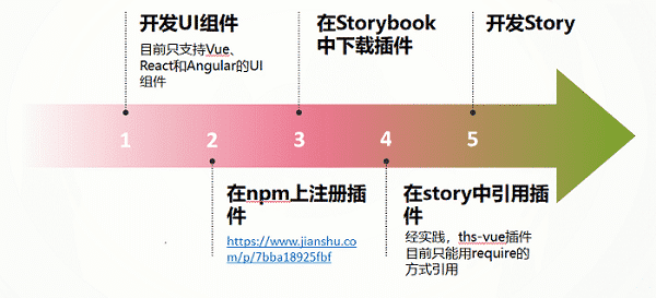
未来我们还会走另一种开发流程,Storybook 项目将作为 vue-component-ts 的一部分,直接导入 vue-component-ts 中的 UI 组件。所以未来我们会省去在 npm 上注册插件的这一步,而改为导入组件库中的 UI 组件。

3 Storybook 的文件目录

1
2
3
4
5
6
7
8
9
10
11
12
13
14
15
16
17
│  .eslintrc.js
│ babel.config.js
│ package.json

├─.Storybook
│ main.js // 配置Storybook的行为信息,还可以在次配置webpack、babel信息。
│ manager.js // 设置插件的行为信息,比如修改插件主题色。

├─src
│ ├─components // 若不使用组件注册的方式来引用UI组件,还可以将UI组件放在该文件夹下,然后在story中引用。
│ │ └─t-button.vue // UI组件源码
│ │
│ └─stories // 所有的UI组件示例都会放在该文件夹下
│ └─charts.stories.js // 这是一个关于charts组件的stories,里面包含了多个charts的story

└─static // 静态目录,放置静态文件
└─mds // 存放有关于story介绍的markdown文档

注意:修改 main.js 后要想使其生效,需要重启项目。

4 快速构建一个 Storybook

4.1 编写一个最基本的 story

一个组件可以编写多个 story 。编写一个组件的 story 有两种方式,一种是 CSF 方式,另一种是 StoriesOf 方式。由于 StoriesOf 是新出的写法,在实践的过程中会存在一些问题,所以还是比较推荐 CSF 方式

首先,我们需要新建一个 xxx.stories.js 文件,或者新建一个文件夹,里面包含着该 UI 组件的所有,每个 UI 组件的 story 都写在这里面。

4.1.1 CSF( Component Story Format )方式

1
2
3
4
5
6
7
8
9
10
11
12
13
14
15
const TVue = require('ths-vue');
// 控制页面如何绘制出你的story,以及如何提供插件使用的信息
export default {
title: ‘echarts/xx’
}

// 柱状统计图就相当于一个story了,所有有关于该story的参数在配置项中配置
export const 柱状统计图 = () => ({
props: {…},
data (){…},
components: {thsBarChart: TVue.thsBarChart.thsBarChart},
template: `
<ths-bar-chart :basic="basic“ :options="options"></ths-bar-chart>
`
})

export default 的常用参数介绍:

1
2
3
4
5
6
7
8
import md from '../../static/mds/thsBarChart.md';

export default: {
title: ‘大标题|文件夹/组件名’, // story所在文件目录的定义,可以控制左侧菜单栏的显示
// story的参数可以用于在story或stories的层次上为各种插件提供配置
parameters: {
    notes: md, // notes是一个插件
}}

4.1.2 StoriesOf 方式

1
2
3
4
5
6
7
8
9
10
import { storiesOf } from "@storybook/vue";
import TButton from "../components/t-button.vue";
storiesOf("PC|统计图", module).add("柱图", () => ({
components: { TButton },
props: {
color: "#FF0000",
label: "确定",
},
template: '<t-button :color="color" >{{label}}</t-button>',
}));

:两种方式不建议写在同一个 story 里。

4.2 Storybook 插件的安装与配置

  1. npm i –D 插件名

  2. 以 addon-knobs 插件为例在 .storybook/main.js 中 module.exports 导出的对象中添加以下内容:

    1
    addons: ["@storybook/addon-knobs"];
  3. 在 story 中引用该插件就 OK 了:

    1
    import { color, text, boolean } from "@storybook/addon-knobs";

4.3 常用插件的使用

4.3.1 Storybook 插件之 Knobs

Knobs 可以用于设置组件传入的参数信息,并实时更新,查看效果(不会改变组件的源码)。

使用方法(这是一段关键代码,props 为一个 story 的其中一个配置参数):

1
2
3
4
5
6
7
8
9
10
11
12
import { object } from '@storybook/addon-knobs';
props:{
basic: {
      default: object(
        '基础配置',
        {
          width: '100%',
          height: '240',
          backgroundColor: '#fff',
        },
      ),
    },

效果:

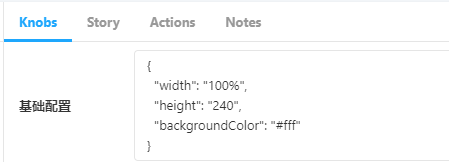
修改 width 、height 、backgroundColor 参数就可以在界面上给组件传参啦~

4.3.2 Storybook 插件之 notes

Notes 可以用于读取指定的 markdown 文档,展示组件的配置参数的类型、含义,介绍组件的配置方式和安装方式等信息。

使用方法:

1
2
3
4
5
6
import md from "../../static/mds/thsBarChart.md";
export default {
parameters: {
notes: md,
},
};

这样就能将 markdown 文档引入到故事中显示了~

友情链接:

Storybook 官网链接

Storybook 使用示例:http://182.48.115.106:8090/svn/Products/前端开发1.0/工程/代码/思路组件库/Vue/storybook

5 md 示例

一个组件主要要介绍的内容有:组件功能简介、组件引用配置示例(即组件源码)和组件配置项说明。以 thsBarChart 组件为例,列举了该组件的 markdown 文档该具备哪些内容:

5.1 组件功能简介

用 vue + echars 实现的柱状统计图,可以选择性地显示多个系列的数据。鼠标 hover 上某段数据能够显示该段数据上所有系列的数据信息。

5.2 组件引用配置示例

在 main.js 中:

1
2
3
import Vue from "vue";
import { thsBarChart } from "ths-vue";
Vue.use(thsBarChart);

在 xxx.vue 文件中:

1
2
3
4
5
6
7
8
9
10
11
12
13
14
15
16
17
18
19
20
21
22
23
24
25
26
27
28
29
30
31
32
33
34
35
36
37
38
39
40
41
42
43
44
45
46
47
48
49
50
51
52
53
54
55
56
57
58
59
60
61
62
63
64
65
66
67
68
69
70
71
72
73
74
75
76
77
78
79
80
81
82
83
84
85
86
87
88
89
90
91
92
93
94
95
96
97
98
99
100
101
102
103
104
105
106
107
108
109
110
111
112
113
114
115
116
117
118
119
120
121
122
123
124
125
126
127
128
129
130
131
132
133
134
135
136
137
138
139
140
141
142
143
144
145
146
147
148
149
150
151
152
153
154
155
156
157
158
159
160
161
162
163
164
165
166
167
168
169
170
171
172
173
174
175
176
177
178
179
180
181
182
183
184
185
186
187
188
189
190
191
192
193
194
195
196
197
198
199
200
201
202
203
204
205
206
207
208
209
210
211
212
213
214
215
216
217
218
219
220
221
222
223
<template>
<ths-bar-chart
:basic="basic"
:options="options"
:nameAlias="nameAlias"
:valueAlias="valueAlias"
:data="data"
></ths-bar-chart>
</template>
<script>
export default {
data() {
return {
basic: {
width: "100%",
height: "240",
backgroundColor: "#fff",
},
options: {
color: [
"#538FFF",
"#FFBF27",
"#FC807A",
"#7BD25F",
"#BE90EA",
"#FF9F37",
],
tooltip: {
show: true,
backgroundColor: "#fff",
textStyle: {
color: "#333",
fontSize: "12",
fontFamily: "PF",
fontWeight: "normal",
},
},
title: {
show: false,
text: "这是标题",
textStyle: {
color: "#666",
fontSize: "16",
fontFamily: "PF",
fontWeight: "bold",
},
left: "center",
},
legend: {
padding: [0, 0, 0, 50],
show: true,
left: "center",
top: 20,
orient: "horizontal",
textStyle: {
color: "#666",
fontSize: "12",
fontFamily: "PF",
fontWeight: "normal",
},
data: ["示例", "示例2"],
},
grid: {
left: 40,
right: 30,
top: 50,
bottom: 40,
},
xAxis: {
show: true,
name: "",
nameTextStyle: {
color: "#666",
fontSize: "12",
fontFamily: "PF",
fontWeight: "normal",
},
nameGap: 10,
boundaryGap: true,
axisLine: {
show: true,
lineStyle: {
color: "#eee",
width: 1,
type: "solid",
},
},
axisTick: {
show: false,
},
splitLine: {
show: false,
lineStyle: {
color: "#eee",
width: 1,
type: "solid",
},
},
axisLabel: {
show: true,
interval: 0,
color: "#666",
rotate: 0,
fontFamily: "PF",
fontSize: "12",
},
data: ["周一", "周二", "周三", "周四", "周五", "周六", "周日"],
},
yAxis: {
show: true,
name: "单位",
nameTextStyle: {
color: "#666",
fontSize: "12",
fontFamily: "PF",
fontWeight: "normal",
},
nameGap: 10,
inverse: false,
boundaryGap: false,
splitNumber: 15,
axisLine: {
show: true,
lineStyle: {
color: "#eee",
width: 1,
type: "solid",
},
},
axisTick: {
show: false,
},
splitLine: {
show: true,
lineStyle: {
color: "#eee",
width: 1,
type: "dashed",
},
},
axisLabel: {
show: true,
interval: 0,
color: "#666",
rotate: 0,
fontFamily: "PF",
fontSize: "12",
},
},
series: [
{
name: "示例",
label: {
show: false,
position: "top",
distance: 5,
color: "#666",
fontFamily: "PF",
fontSize: "12",
},
barColor: "",
barWidth: 4,
borderColor: "rgba(0,0,0,0)",
borderWidth: 2,
backgroundColor: "",
data: [120, 132, 101, 134, 90, 230, 210],
stack: "示例2",
},
{
name: "示例2",
label: {
show: false,
position: "top",
distance: 5,
color: "#666",
fontFamily: "PF",
fontSize: "12",
},
barColor: "",
barWidth: 4,
borderColor: "rgba(0,0,0,0)",
borderWidth: 2,
backgroundColor: "",
data: [12, 13, 10, 13, 9, 23, 21],
},
{
name: "示例3",
label: {
show: false,
position: "top",
distance: 5,
color: "#666",
fontFamily: "PF",
fontSize: "12",
},
barColor: "",
barWidth: 4,
borderColor: "rgba(0,0,0,0)",
borderWidth: 2,
backgroundColor: "",
data: [122, 13, 10, 13, 9, 23, 21],
},
],
dataZoom: {
show: false,
maxPointNum: 10,
},
},
nameAlias: "date",
valueAlias: "revenue",
data: [
{ date: "星期一", revenue: 43 },
{ date: "星期二", revenue: 54 },
{ date: "星期三", revenue: 82 },
{ date: "星期四", revenue: 48 },
{ date: "星期五", revenue: 10 },
{ date: "星期六", revenue: 82 },
{ date: "星期天", revenue: 28 },
],
};
},
};
</script>

5.3 组件配置项说明

  • basic(即 knobs 中的基础配置)

    属性名 属性含义 数值类型 示例(默认值)
    width 整个统计图的宽度 百分比 | 数值 “width”: “500”
    height 整个统计图的高度 数值 “height”: “400”
    backgroundColor 统计图背景颜色 颜色值 “backgroundColor”: “#fff”
  • options

    options 的配置项比较多,配置了 tooltip 、title 、legend 、grid 、xAxis 、yAxis 、series:

    (以下仅举例 tooltip 、title 、legend 这三种配置项的说明作为参考)

    1. tooltip(提示框组件)

      属性名 属性含义 数值类型 示例(默认值)
      show 是否显示提示框组件 布尔值 “show”: true
      textStyle 提示框组件的字体样式配置 对象 “textStyle”: { “color”: “#333”, “fontSize”: “12”, “fontFamily”: “PF”, “fontWeight”: “normal” }
      backgroundColor 统计图背景颜色 颜色值 backgroundColor: ‘#fff’
    2. title(统计图标题)

      属性名 属性含义 数值类型 示例(默认值)
      show 是否显示统计图标题 布尔值 “show”: false
      text 统计图标题的文本内容 字符串 “text”: “这是标题”
      textStyle 统计图标题的字体样式配置 对象 “textStyle”: { “color”: “#666”, “fontSize”: “16”, “fontFamily”: “PF”, “fontWeight”: “bold” }
      left 统计图标题的排版设置 字符串 | 数字 “left”: “center”
    3. legend(图例)

      属性名 属性含义 数值类型 示例(默认值)
      padding 图例的内边距 数组 “padding”: [0, 0, 0, 50]
      show 是否显示图例 布尔值 “show”: true
      left 图例的排版设置 字符串 | 数字 “left”: “center”
      top 图例到统计图顶部距离 字符串| 数字 “top”: 20
      orient 图例的排列方向 字符串 “orient”: “horizontal”(水平排列)
      textStyle 图例的字体样式 对象 “textStyle”: { “color”: “#666”, “fontSize”: “12”, “fontFamily”: “PF”, “fontWeight”: “normal” }
      data 图例的数据 数组 “data”: [“示例”, “示例 2”]
作者

老吕

发布于

2020-09-27

更新于

2023-08-05

许可协议

CC BY-NC-SA 4.0

评论